Mockups
Visual previews of what we're building. Each card links to a live page. Cards tagged Done are shipped to production. Mockup = preview only.
World-Class CMS
4Section Panel — Full Field List
What the operator sees clicking a top-level section. Background, Border, Shadow, Color, Padding — all the tools any image tool has.
Open mockupSection Edit Mode (page drag)
First try — drag on the actual page to reorder. Works but messy. See Structure panel mockup for the better pattern.
Open mockupStructure Panel (Elementor-style)
Tree of sections/containers/widgets on the left, page stays normal on the right. Drag, reorder, nest. No overlays on the page.
Open mockupStructure Panel + Resize
Same as Structure, plus dashed line drag handles. Hover to reveal. Snap to 100/200/400/600/800px. Alt = free. No extra chrome.
Open mockupMobile — per-section 2-col toggle
Cards/galleries stay 2-col. Text stacks. Per-section override + ratio buttons + auto-collapse breakpoint. Live preview at viewport width.
Open mockupReal example — Tree Academy
Same homepage, 3 viewports. S-1/S-5/S-8/S-9 stack. S-3 Services (cards) keeps 2-col. See badges (top-right) showing the toggle state per section.
Open mockupWhere the toggle lives — Inspector
Click a section → Layout tab → Responsive group below Columns/Gap. 3 controls + live preview at 390px. Badge on each section shows current state.
Open mockupFvRE — section type detection
The brains behind the toggle. Heuristics + scores + type enum (HERO/FULL/INNER/COLS/CARDS/TEXT/CTA/FOOTER). Defaults drive the toggle; operator can override.
Open mockupWidget library + insert + renumber
23 widgets. Manual + AI paths. Click slot, drag from library, or quick-add. Slots = addresses, UUIDs stable. Renumber is free.
Open mockupBottom bar placement + GDPR
Bar moves to safest empty slot. Stacks above app bars, hides for GDPR, floats top when chat bubbles squat the corner. Re-evaluates on scroll/resize/mutation.
Open mockupDev mode toggle — the single entry point
Floating icon, bottom-right, 44pt. OFF = clean visitor page. ON = chips, dock pills, panels, outlines all appear. Uses existing setDevMode. Drag to reposition.
Open mockupSamsung-style edge panel
4px edge handle. Swipe in → 2-col grid of 12 CMS tools. Tabbed (Tools / Recent). Persistent footer with + Section/Container/Widget. Future: second-swipe reveals paired panel.
Open mockupEdge panel v2 — 33% max, dock untouched
Additive to dock. Width: 220px mobile (56%), 280px tablet (36%), 360px desktop (25%), hard cap 33vw. Dock stays as-is. Click icon → dock panel opens, edge slides out.
Open mockupEdge panel v3 — single column, way narrower
140px mobile (36%), 160px tablet (21%), 180px desktop (12.5%). Icon list with name + tooltip. Super-narrow 72px (18%) as floor. App stays mostly visible.
Open mockupEdge panel v4 — 2-col, tight padding (harsh)
Same widths, but neon accent + saturated darks. Replaced by v5.
Open mockupEdge panel v5 — softened a bit (still felt like v4)
Soft mint + warm neutrals + AA. But the changes were too subtle — looked like v4. Replaced by v6.
Open mockupEdge panel v6 — soft sage + warm cream (had radius bug)
Dusty sage, warm dark panel, muted forest. But the panel had 12px border-radius showing on the right edge under the tab bar. Replaced by v7.
Open mockupEdge panel v7 — edge-to-edge, no radius, tighter padding
Panel is edge-to-edge on the right (no border-radius visible). 152/180/220px (was 168/200/240). Sage + cream palette from v6 kept.
Open mockupMedia Library
Replaces the "coming soon" stub. Search, filter by type, multi-select, insert. Gallery of every image in the FreshVibe CMS asset store.
Open mockupDock Pills Always Visible
Docked panels now sit behind the dock pills. You can always switch panels, even when one is docked in front.
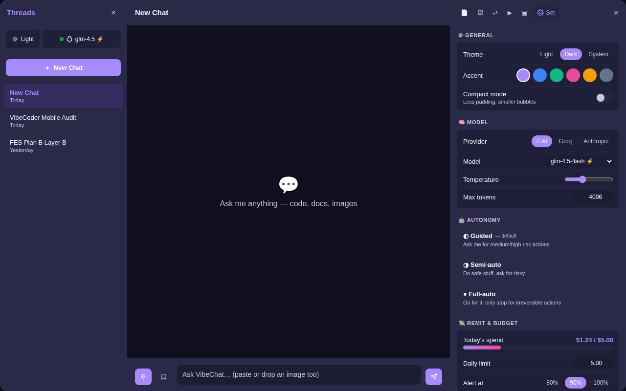
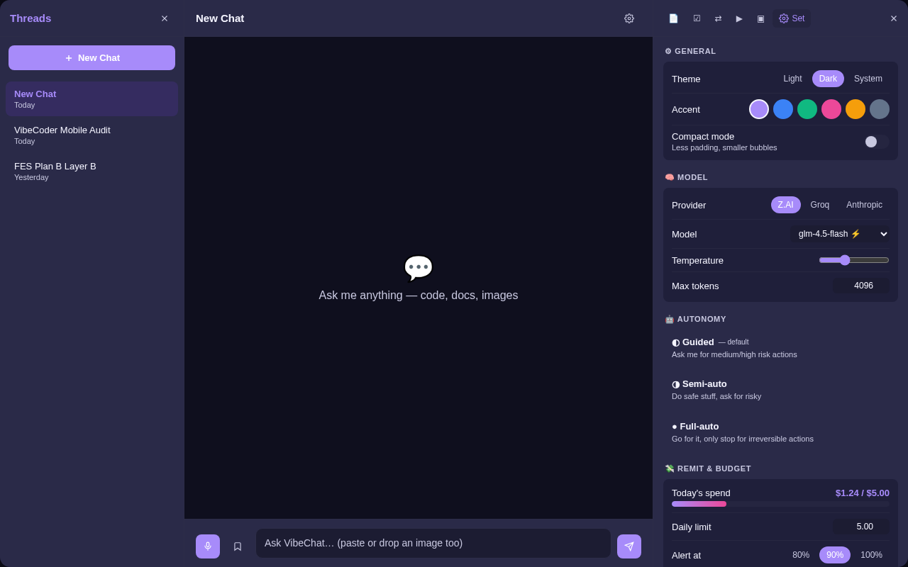
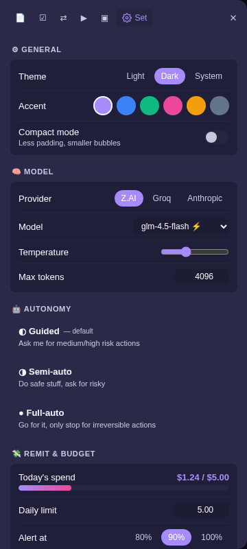
Open mockupVibeChat
2Old S3 Layout
4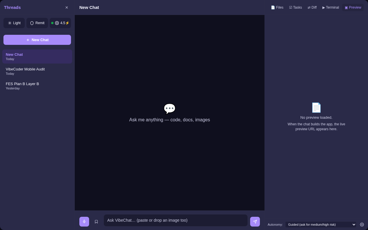
Research & Docs
2Magic App Builders — Cons + FVW v8 Assessment
20 user-reported cons of Lovable, Bolt, v0, Cursor, Base44 — and how the FreshVibe Way v8 doctrine negates most of them.
Open researchFVW v8 + VibeCoder — 12-Week Roadmap
7 phases from foundation to ecosystem. Concrete Day 1-7 work list. 18 new modules, 4 new skins, real backend, edit-in-place.
Open roadmap